
Arby's Digital Ecosystem
Within the Arby's digital ecosystem project, my main role was anything and everything revolving around the responsive web. From user flows and site maps, to all wireframes for desktop, & mobile. The ask of the project also incorporated a mobile native app, and prototyping for user testing. Alongside responsive web responsibilities, I created proto.io prototypes for mobile app testing, both iOS and Android. Throughout the project we stuck to a lower fidelity wireframe style because of the visual design system being established at a parallel speed. For prototyping, we used visual design comps.


Customization Flow.
The above flow solved for the problem of a customer wanting to choose a meal and then customize to their liking. Some of the biggest challenges came from the abundance of choices a user has, as well as navigational elements; distinguishing back, exit, done and next.
Sandwich to Meal / Desktop.
With a mobile first approach, we were able to create a very clean UI that translates to desktop using the same navigational elements throughout.

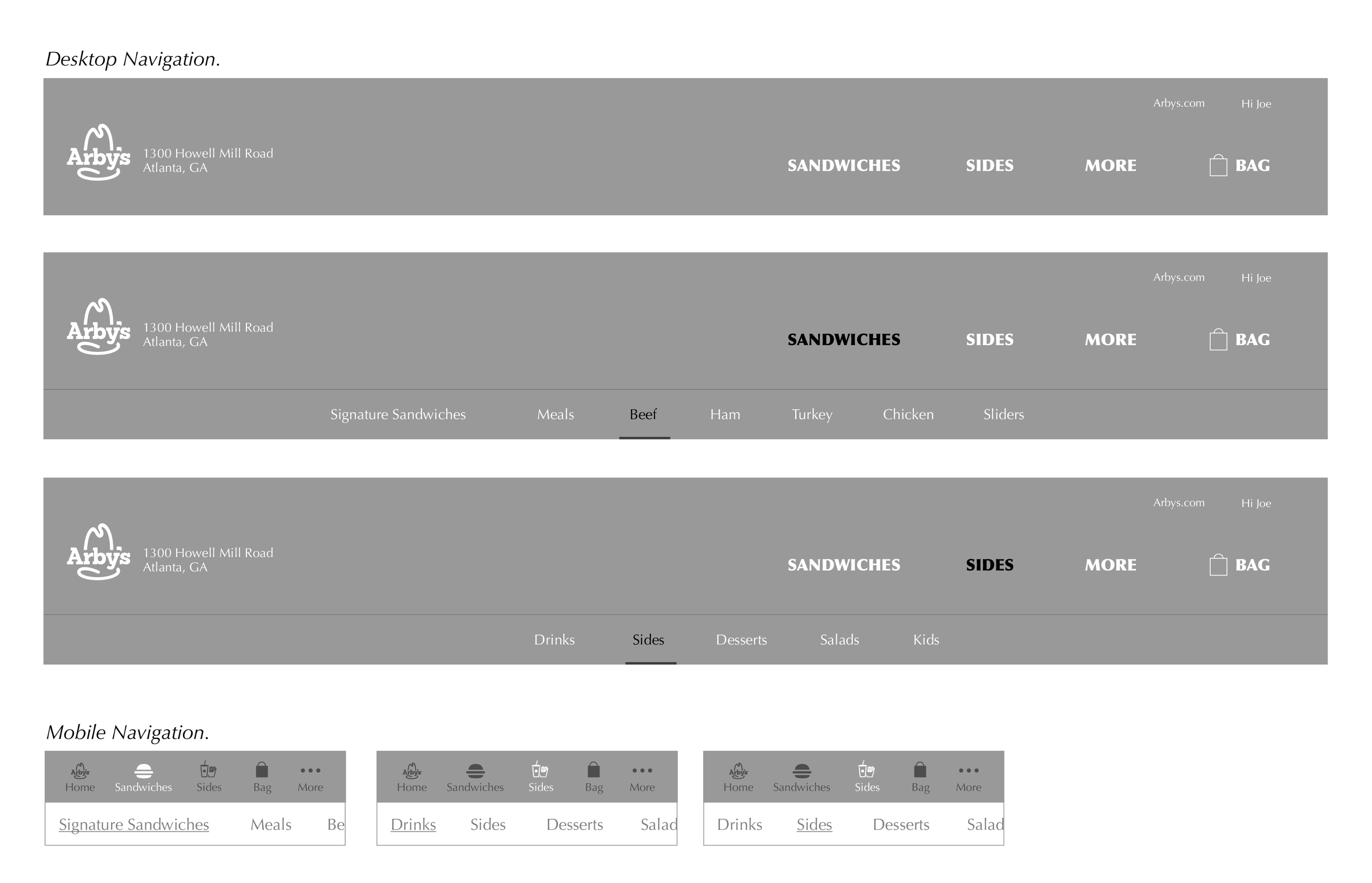
Navigation.
Hand off Paths.


User Flows.
Multiple different scenarios throughout the ordering process were found and solved by creating user flows.

