NCL Site Redesign
The pitch for Norwegian Cruise Line included major parts of the experience. From the (complicated) cruise booking experience, to searching, filtering, and determining the content that should be curated on the homepage. This pitch was longer than the typical, so extensive research was done within the cruise line industry, along with parallel industries. After a thorough competitive analysis, I took that research and had the responsibility of creating search result tiles that relayed the correct content to the user, recreating the filters and sorting mechanisms that currently existed, as well as reimagining the homepage search.
Identified Experience gaps
Ideated on improvement within those gaps
Identified business value opportunities
Defined personas & customer journeys to tell our story
Competitive audits of all sorts
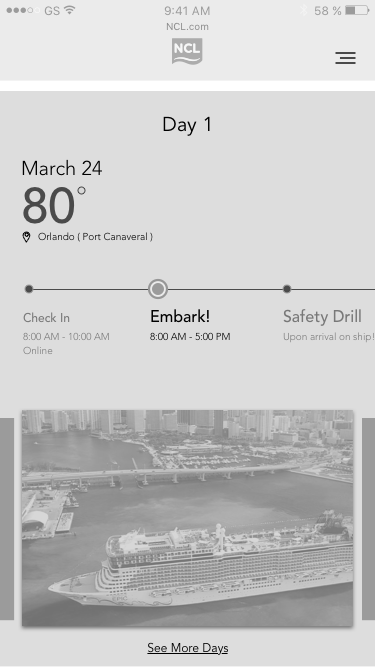
Redefined the booking process
Homepage Exploration

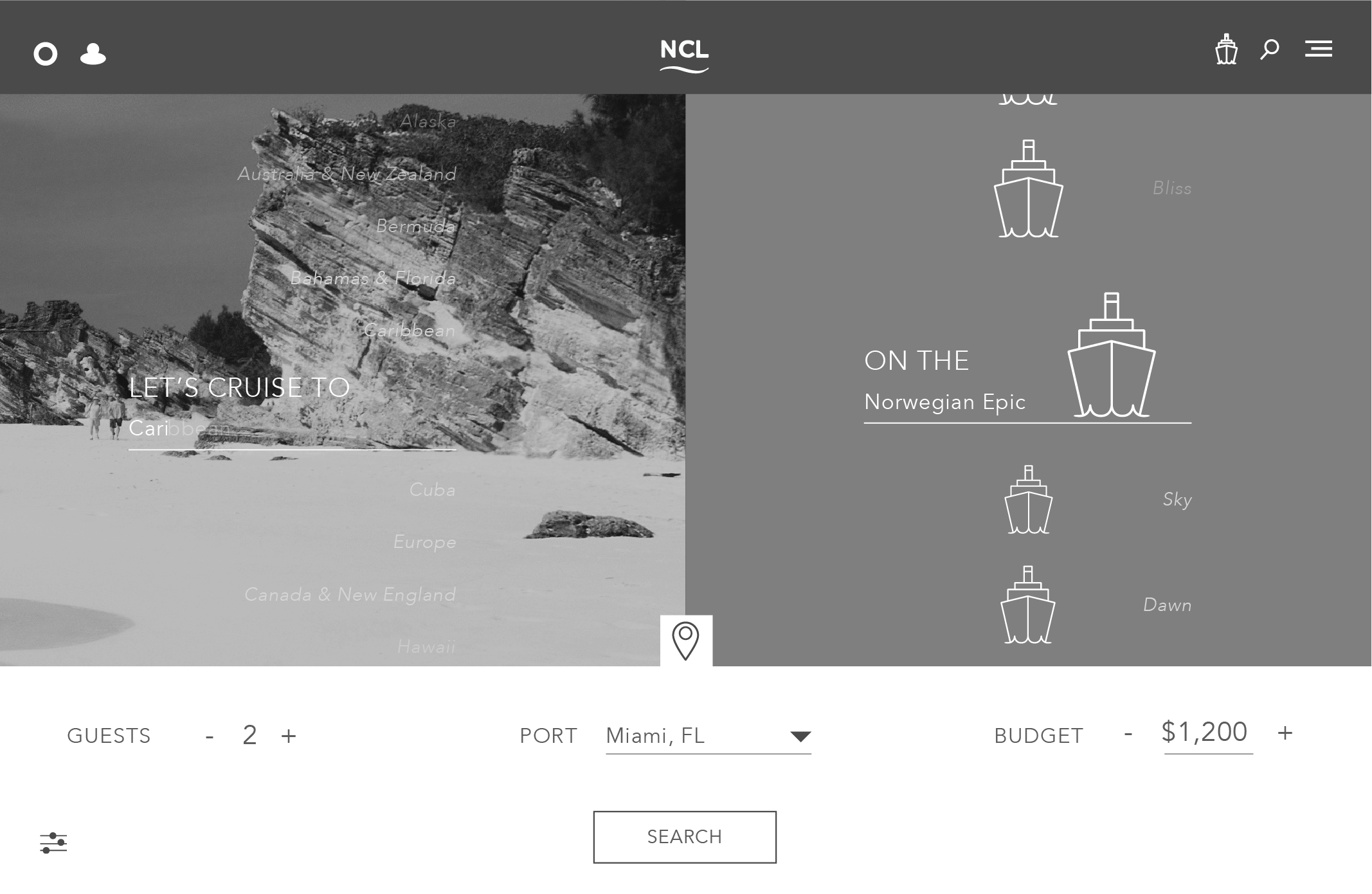
Option to input as many or as little filters desired. Flip to map view.

Map view homepage, reacting as user fills in filters.
Non Contextual Homepage

Homepage Visual Design

Result Tile Exploration
Through extensive research and competitive analysis, we realized one of the biggest problems with the current industry is how the cruise information is displayed to the user. We wanted to put the right hierarchy of content within the result tiles. These are a few of the final explorations to the result tile.